Let’s talk about logo design tips for caps. Think of your cap as a tiny billboard – small but mighty. A well-designed cap can carry your brand into offices, gyms, festivals, and even Instagram feeds. But because you’re working with limited space, the design choices you make matter more than ever. Whether you’re creating promotional caps for a major event or embroidered caps for your team, here are the practical tips to make your logo stand out every time.
Pick Contrasting Colours
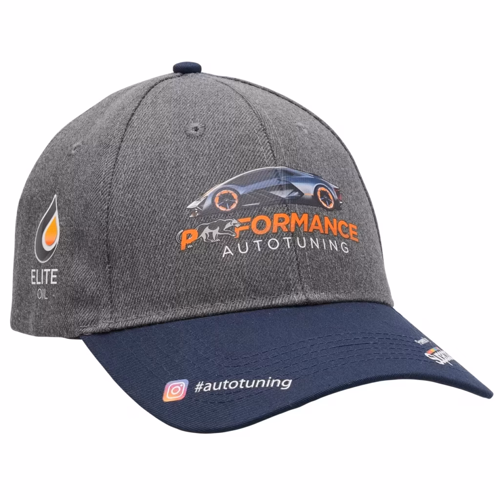
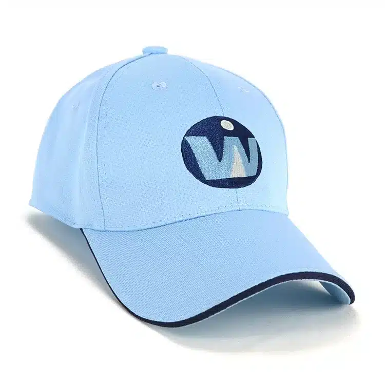
One of the quickest ways to make your logo pop is through colour contrast. A white logo on a navy cap or a black logo on a khaki cap is instantly clear and easy to read. Subtle on subtle (like grey on grey) might work on stationery but can disappear on a cap.
Pro tip: Use your brand’s primary colour for the logo and a complementary or neutral shade for the cap. This keeps the focus on your branding.
Examples: Sports clubs often go bold with white-on-black embroidery, while corporate promotional caps often stick to navy, grey, or charcoal with a lighter logo for maximum legibility.
Best for: Logo caps at tradeshows, outdoor events, or sports days where visibility is key.
Keep Layouts Clean
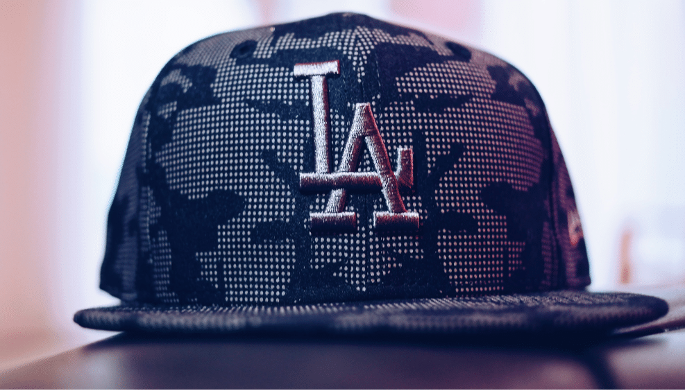
When it comes to cap design, less really is more. Caps don’t give you the space of a T-shirt or a brochure, so trying to squeeze in taglines, phone numbers, or complex graphics will overwhelm the look. A single strong logo or a simplified brand mark nearly always works best.
Pro tip: Treat the front panel as prime advertising real estate – bold and uncluttered wins.
Examples: Breweries often use just their logo mark on the front panel and save slogans for the side or back strap. This keeps the design clean while still giving extra brand presence.
Best for: Branded caps used as part of uniforms, where professionalism and clarity matter.
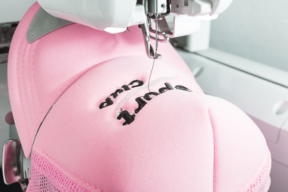
Use High-Resolution Artwork
Blurry logos are one of the fastest ways to make your brand look unprofessional. Always provide your supplier with vector artwork (AI, EPS, or SVG) or at least a high-resolution file. Clear artwork ensures embroidery is sharp and print colours match your brand identity.
Pro tip: Avoid screenshots, stretched images, or pixelated jpegs. Crisp artwork means crisp embroidered caps.
Examples: Companies with fine details in their logos often simplify or create embroidery-specific artwork to keep the look clean.
Best for: Custom caps with intricate logos, gradients, or PMS colour-matching requirements.
Think About Placement
Front and centre is the classic choice for a reason, but creative placements can make a promotional cap feel more unique. Side panels, the back strap, and even under the brim are spots for secondary logos, hashtags, or slogans. These add a subtle touch without competing with the main design.
Pro tip: Keep the main logo front-facing and let extra placements add personality.
Examples: Streetwear brands often use under-brim prints, while corporates might add a small embroidered web address on the back strap.
Best for: Personalised caps where you want to give wearers something a little more distinctive.

Match the Style to Your Brand
Different cap styles send different messages. A structured snapback is bold and modern, while a dad hat is casual and approachable. Trucker caps with mesh backs signal outdoor or sporty vibes, while stretch-fit caps lean sleek and professional. In 2025, rope accents and perforated fabrics are also trending, each adding a unique edge.
Pro tip: Think about the audience first. A corporate conference giveaway might suit stretch-fit embroidered caps, while a youth event or music festival may call for branded snapbacks.
Examples: Fitness brands often prefer perforated logo caps for breathability, while lifestyle labels lean into dad hats for that laid-back look.
Best for: Promotional campaigns where brand personality needs to shine through in the design.
Why It Matters
Caps aren’t just accessories. They’re one of the most visible promotional products because people wear them again and again. When your logo is clear, eye-catching, and thoughtfully placed, your cap becomes more than a freebie – it’s wearable advertising that keeps your brand in the spotlight.
If you’d like to see more about how custom caps balance fashion and branding, this article from Dennis Wisser explores why baseball hats remain such a powerful marketing and style tool.
Caps aren’t just accessories. They’re one of the most visible promotional products because people wear them again and again. When your logo is clear, eye-catching, and thoughtfully placed, your cap becomes more than a freebie – it’s wearable advertising that keeps your brand in the spotlight.
For a full overview of styles, explore our range of Custom Caps to see what’s possible for your next campaign.