(Because “just slap the logo on” isn’t a strategy.)
When Good Caps Go Bad
We’ve all seen it. The company cap that looks like it was designed by someone who’s never met a head. The logo’s either the size of a dinner plate, the colour clashes with everything within a five-metre radius, or the embroidery’s doing that awkward “bumpy” thing.
Badly branded caps are like bad coffee — technically functional, but no one enjoys them.
The good news? It’s incredibly easy to avoid those mistakes. You just need a little know-how, some realistic expectations, and a supplier who knows their way around both a bobbin and a brand guide.
This guide walks you through how to get your cap branding right — so your team, customers and event guests actually want to wear them.
(If you haven’t already read The Really Quite Good Guide to Promotional Caps, start there for a refresher on styles and materials. Then pop back here for the fun stuff.)
First Things First: What Makes a Cap “Brandable”?
Not all caps are created equal. Some give you acres of space to showcase your logo; others, not so much.
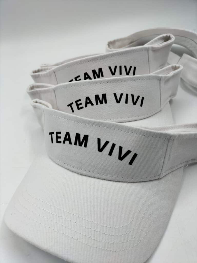
Front Panels: Prime Real Estate
This is your main stage. Structured caps give you a smooth, firm canvas for embroidery or patches, while unstructured caps provide a more relaxed, curved surface which are great for a casual vibe but trickier for big, detailed logos.
Side Panels
Understated and cool. Perfect for small icons, initials, or website URLs. It’s branding that whispers instead of shouts.
Back Panels
A good spot for slogans or web addresses. Think of it as your encore – the last thing people see as you walk away (hopefully triumphantly).
Under the Brim
Yes, it’s a thing. Subtle branding or colour contrast under the brim adds a touch of class without screaming for attention.
Before you even start talking decoration methods, choose a cap style that suits your brand personality and gives you the right space to work with.
Decoration Methods Decoded: The Good, The Bold & The Textured
You’ve got options, and not just “printed or embroidered.” Here’s a quick run-through of the main ways to get your logo onto a cap, with the pros, cons, and typical use cases.
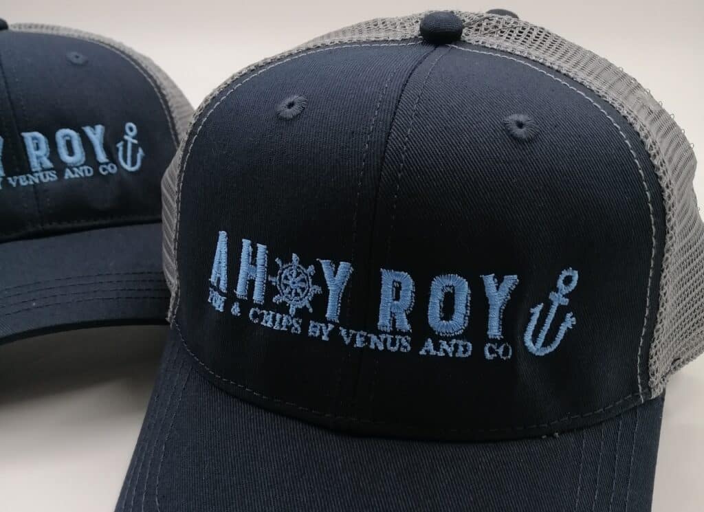
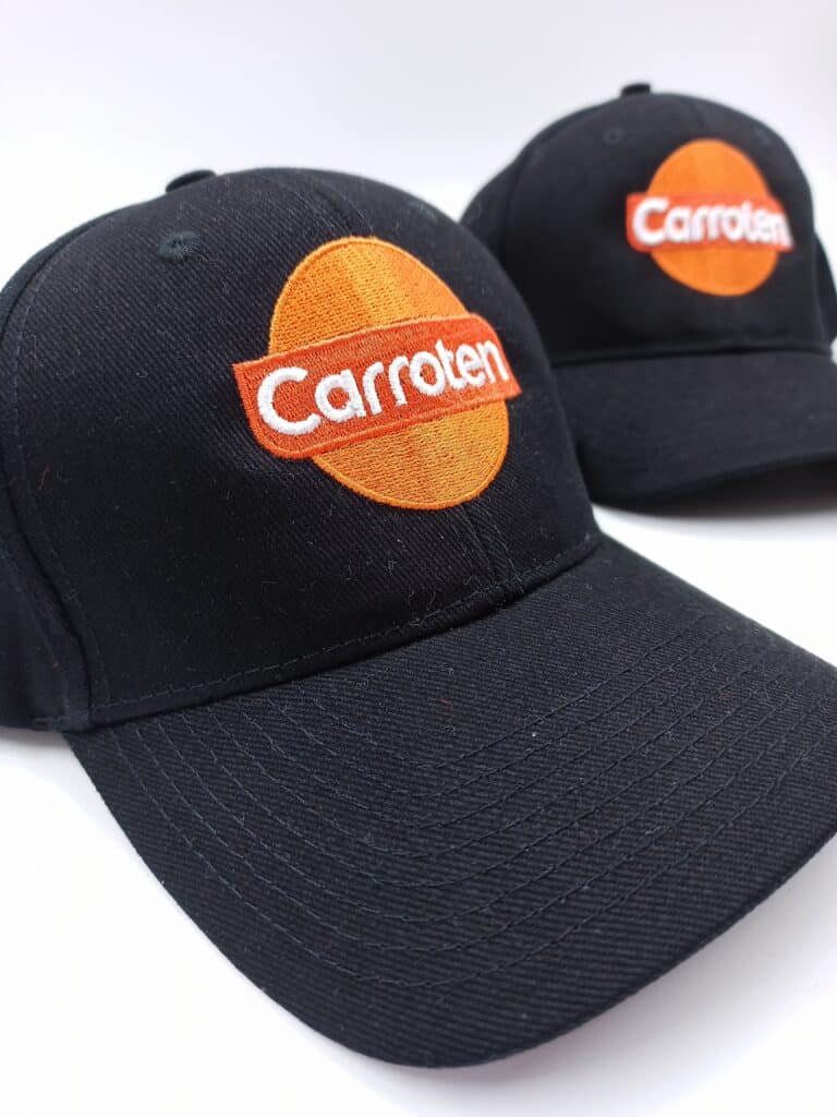
Embroidery
The OG of cap branding. Durable, classic, and tactile.
Best for: Structured cotton or twill caps, uniforms, giveaways where longevity matters.
Pros: Professional, long-lasting, works well on curved surfaces.
Cons: Fine detail can get lost; not ideal for super-small text.
Fast Caps Tip: Simplify your artwork before stitching – bold shapes and minimal detail always win.
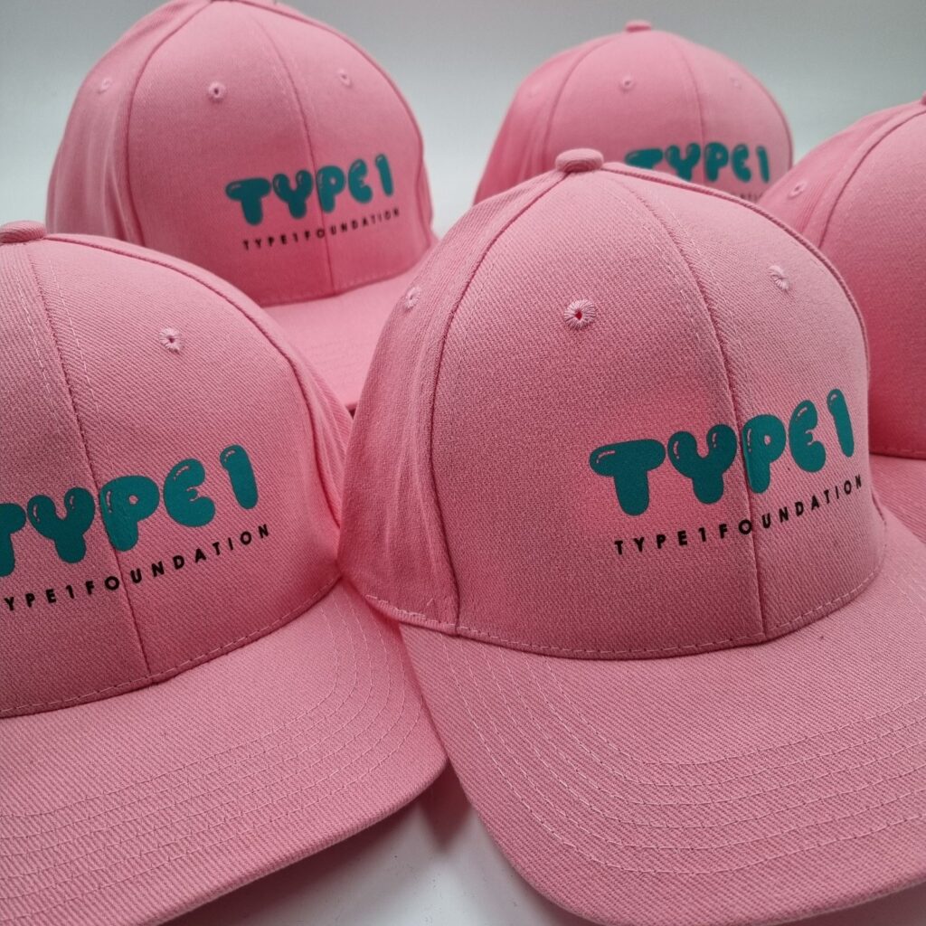
Screen Printing
Great for bold, flat designs. Ink is applied directly to the fabric through a stencil.
Best for: Flat or foam-front trucker caps, high-volume orders, large logos.
Pros: Vibrant colours, cost-effective at scale.
Cons: Can crack or fade over time, and doesn’t love textured fabrics.
Fast Caps Tip: If your logo has intricate gradients, maybe give printing a miss and check out heat transfer instead.
Heat Transfer
Think of it as a tattoo for your cap – a printed design applied using heat and pressure.
Best for: Short runs, complex logos, full-colour designs.
Pros: Crisp detail, great colour accuracy.
Cons: Not as durable as embroidery; may peel with heavy wear.
Fast Caps Tip: Ideal for campaign-specific caps or events that don’t need years of wear.
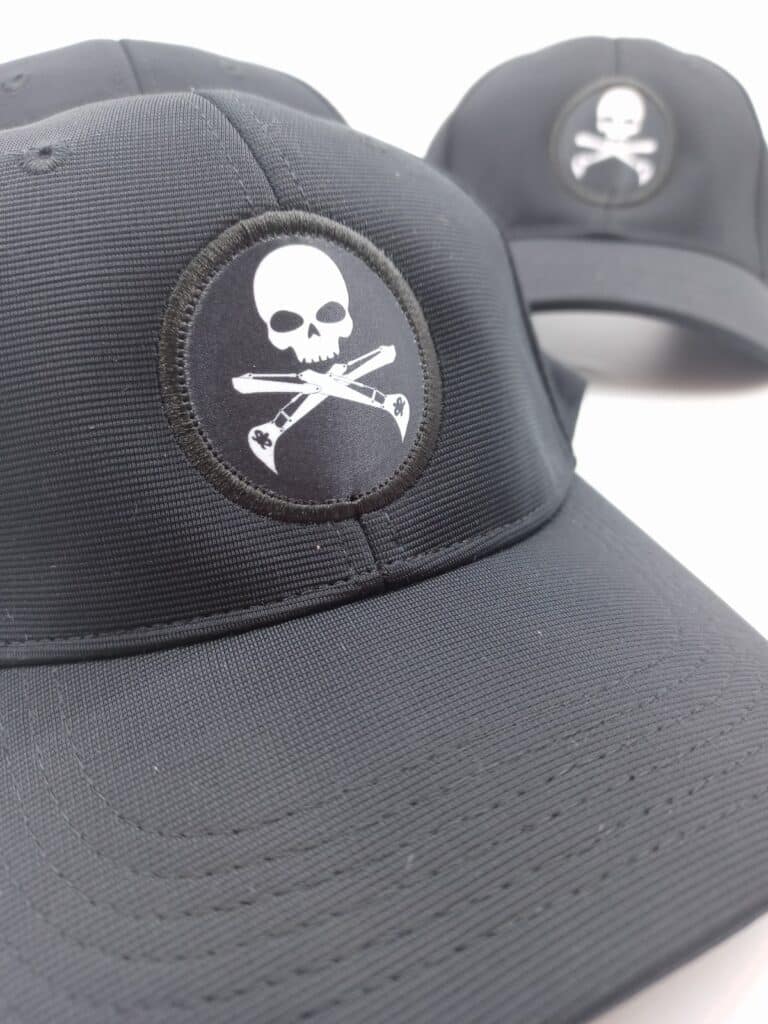
Woven or Embroidered Patches
On-trend and a bit fancy. Patches can elevate even the simplest logo into something tactile and collectible.
Best for: Snapbacks, trucker caps, or any cap you want to feel premium.
Pros: Adds texture, feels high – quality, flexible placement.
Cons: Slightly higher cost per unit, longer lead times.
Fast Caps Tip: Go circular – round patches tend to frame logos beautifully and sit neatly on curved panels.
Want more detail on methods, materials, and art prep? Check out The Really Quite Good Guide to Promotional Caps for a deeper breakdown of cap types and textures.
Placement Matters (More Than You Think)
Logo placement isn’t just a technical choice – it’s design psychology.
Front and Centre
The classic move. Works best for logos that are short and wide. But be warned: too large, and you risk “forehead billboard” territory. Keep it balanced.
Side Panel
A clever alternative if you want subtlety. A small logo on the side makes people curious enough to lean in (bonus exposure).
Back
Ideal for secondary details — your tagline, website, or event year. Adds a little Easter egg for anyone following behind.
Off-Centre or Asymmetrical
Slightly edgy and eye-catching without being loud. Brands going for a creative or youthful feel often use this trick to stand out.
Under the Brim
Reserved for clever messages, limited editions, or inside jokes. Perfect for brands that don’t take themselves too seriously.
Fast Caps Tip: Ask for a digital mock-up before approving anything. It’s amazing how different a design can look once curved around a real world cap shape.
Colour and Contrast: Making Your Logo Pop (Without Burning Eyes)
Colour matching is one of those details that can make or break your final result.
Thread and Ink Choices
Your logo might look brilliant on a screen but terrible stitched in thread. Always compare physical swatches before going to production.
If your brand colours are critical (and they usually are), request Pantone matching. It ensures your cap’s thread or print colour aligns with your official palette.
Visit Pantone’s colour guide if you want to nerd out about exact hues.
Contrast Is King
Light logos on dark caps stand out best; dark logos on light caps are easier on the eyes. Tone-on-tone embroidery can look classy, but only if visibility still works in natural light.
Think About Outdoor Reality
Caps live in sunlight. UV can fade cheap inks and threads, so it’s worth investing in UV-resistant materials if your caps will spend time outdoors.
Fast Caps Colour Tip:
When in doubt, start simple – white logo on navy, black on grey, or vice versa. Clean, timeless, and safe from seasonal trend regret.
Size Does Matter (Logo Size, That Is)
Too small and no one notices it. Too big and it feels like you’ve been head-branded by a marketing intern on a power trip.
As a rule of thumb:
- Front logo width: 9–11 cm wide works for most adult caps.
- Height: Around 5–6 cm keeps proportions balanced.
- Side logos: 4–5 cm wide max.
Always ask your supplier for embroidery or print area templates. They’ll know what looks natural once it’s wrapped around a real head (rather than a flat screen).
Common Branding Fails to Avoid (And How to Fix Them)
1. Too Much Detail
That intricate gradient and fine serif typeface might look great in your brand manual, but not when translated into thread.
Fix: Simplify your artwork – fewer colours, thicker lines, cleaner shapes.
2. Ignoring the Curve
Flat artwork on a curved surface = warped logo.
Fix: Work with a decorator who previews the design on a 3D template.
3. Poor Colour Choices
Nothing says “we didn’t think this through” like yellow on white.
Fix: Stick to strong contrast – if you’re unsure, do a test print.
4. Going Too Cheap
Yes, budget matters. But the cheapest thread or print option can fray, fade or peel faster than your campaign ends.
Fix: Invest in mid-range or better. Longevity is the real return on investment.
5. Wrong File Format
JPEGs are fine for memes, not for embroidery.
Fix: Always send vector artwork (.AI, .EPS, or .PDF) so your lines stay crisp and scale correctly.
Sustainable Branding Choices (Because Logos Can Be Green Too)
Branding doesn’t have to come at the planet’s expense.
These days, you can go eco-friendly without sacrificing quality or colour fidelity.
- Recycled Threads: Made from reclaimed fibres but just as durable.
- Low-Impact Inks: Water-based and less toxic, great for screen printing.
- Smarter Materials: Organic cotton or recycled polyester caps look and feel identical to standard ones.
- Long-Life Designs: A well-made cap worn for years is infinitely greener than one that falls apart after three washes.
For more on ethical materials and production options, head to Sustainable & Eco-Friendly Promotional Caps
Workflow Tips: From Artwork to Finished Cap
Even the best design can turn chaotic without a process. Here’s how to keep things smooth:
1. Brief Like a Pro
Start with purpose: who’s wearing the cap, where, and why. The clearer your intent, the easier the design decisions become.
2. Approve the Artwork Proof
Once you’ve chosen your decoration method, your supplier will send a digital proof. Don’t skim it – zoom in, check alignment, confirm Pantone numbers, and ensure the scale looks realistic.
3. Request a Physical Sample
A real sample lets you test colour, texture, and fit. Keep it. It becomes your gold standard for future orders.
4. Confirm Production & Delivery
Ask for clear timeframes. Embroidery usually takes longer than printing, especially for large runs. Build in buffer time for shipping.
5. Quality Check on Arrival
When the boxes arrive, open them! Randomly inspect a few caps from different cartons. Check stitching, colour consistency, and placement.
Follow these steps, and you’ll look like a logistics genius while everyone else is still wondering where their boxes went.
Your Handy Cap Branding Checklist
Before you hit order, here’s your sanity-saving list:
- Choose the right cap style for your audience
- Pick a decoration method that fits your artwork and purpose
- Simplify your logo — clarity beats complexity Match colours to Pantone standards
- Preview placement on a real-world template
- Get a pre-production sample
- Confirm production and delivery timelines
- Consider sustainable materials and inks Order a few extras (someone always wants another)
Stick to that list, and your branding project will run smoother than a freshly steamed brim. (ha ha)
Branding That Makes People Want to Wear It
When done well, a branded cap isn’t a piece of merch – it’s wearable brand pride. It’s the hat your staff grab on weekends, the one your clients pack for their holiday, and the one that somehow sneaks into every team photo.
The trick isn’t complicated: choose a style that fits your brand personality, keep the design simple and thoughtful, and work with decorators who care about the details.
If you do that, you won’t just be “putting your logo on a cap.” You’ll be creating a little piece of your brand story – one that actually gets seen, used, and remembered.
Ready to start designing your next batch? Browse the full range of custom promotional caps at Fast Caps and let’s make something people genuinely want to wear.